Showing posts with label teaching. Show all posts
Showing posts with label teaching. Show all posts
Thursday, December 19, 2013
My whiteboard 6th grade art
Saturday, November 30, 2013
Class mural 2013

This was my last student mural. This one is 3' x 27', dry erase marker on glass. This was done by an 11th grade section. The theme is anything/everything ancient Greek.
Monday, October 28, 2013
Perspective Window
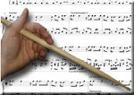
One of my favorite things to teach is the development of one-point linear perspective through the renaissance. This image is of the main window in my studio and it illustrates many of the concepts I include in the lessons, beginning with Brunelleschi and Alberti in 1435. I put white paper on the outside of the window so the image would show up better. The window is about 3' x 4'.


Friday, May 18, 2012
Classroom Mural 2011, 10, 09
 |
| 2011 |
 |
| 2010 |
 |
| 2009 |
Wednesday, May 12, 2010
Dragons
 The following pieces are student work. They are 36" x 46", acrylic, pencil, marker, colored pencils, and collage. In this case the collage is Joss paper for the background. The girl who drew the dragans is a seventh grader. She copied the images from some dragons she found on line and made a few modifications. She did most of the painting too but got way bogged down and I had to assign some classmates to help her complete the collage and finish the painting.
Toys
 This piece is adorable. The girls who made it thought toys would be a great topic for a painting, so we looked at several paintings to get some composition ideas, then used clip art as a model. Yes clip art. Simple, iconic shapes... emblematic representations of abstract archetypes. This piece was done by two seventh grade girls and an eighth grade boy. 36" x 46" acrylic, pencil, marker, colored pencils, on cardboard.
Dragon Tower
 I love this one. Two completely different personality types came together and succeeded quite well. Two tough guys and two nerds. Get this, a tough guy painted the silly dragon in the foreground, and a nerd kid painted the dragon in back. I'm glad they decided to change it so the flames spread all the way across the central line, makes a nice seperation and sense of perspective. I like the final decorative touches like the scroll work across the top and the lovely, delicately painted path. Guess what... the other tough guy poured over that path for three class periods.
Sea Life
 One thing I really wanted to avoid in this project was the use of large areas of flat color. I wanted students to learn to modulate color using brush, pencil, and ink techniques. You know, show me gobs of texture and visual depth blah, blah, blah... These guys were the most dificult group to motivate. I had to push and push these guys (well, girls mostly) but look what they came up with. Sure, they satisfied me with the glazing and drawing in the squid so when they thought to paint the background 6 different shades of undmodulated blue I thought... okay. Nice touches like the nasty yellow teeth on the shark.
Robots
 This is what happens when you put one girl with three boys. I love this one. I said, if you could draw whatever you wanted, what would you draw and the seventh grade girl took a book on how to draw animals. She showed me adorable sketches and I said okay. The boys took a long to think of what would be cool. Finaly they kind of agreed on robots, and I encouraged them to run with that. All the animals were done by the girl, the glazing in the tigers coat, the ala prima in the bunny, and the fine pencil work in the mouse and squirel. I love the two robots, one with fire in his belly and the other with cold clockwork steel. The fence was done with several rulers that have a circular hole in the end. The students used these as templates to cover the entire background with perfect little circles. They left some holes to make it really look like old chicken wire.
Sunday, May 9, 2010
Animals
 Another middle school piece, this one was really driven by a 7th grade science geek. He convinced the group that they should do a composition progressing from fish to reptile to bird to mamal. Along the way they all learned blending and glazing, composition and design elements, collage techniques, and other mixed media methods.
Flowers
 This is the first in a series of images created by my middle school and high school students. 36" x 46", acrylic, ink, pencil, and colored pencil on cardboard. None of these students has ever done a painting of this scale. They worked in groups, this one was painted by four high school girls who only want to paint "pretty things". They copied from clip-art images of flowers, drew them larger, and arranged them to create a composition. They drew, then painted using glazes in the ribbons and ala prima techniques elsewhere. This is the culmination of a semester of work.
Saturday, February 20, 2010
Whiteboard Mural II
 12' x 4' dry erase on whiteboard. This my student's work. I've been having my classes create murals on the whiteboard as part of my classwork. For this one they took random "clip art" images, enlarged them, and arranged them into a composition. If you look closely you'll see two yardsticks in the tray at the bottom - gives you a better idea of the scale.
Wednesday, December 2, 2009
Whiteboard Mural
 15' X 4' dry erase marker on whiteboard. This started when I told my students to graffiti my whiteboard. 32 markers and a couple of weeks and this is the result. They did require some direction but it's amazing how every student said they can't draw! This has actually become legendary with everyone involved claiming bragging rights. The following are closeups, left to right.


Saturday, September 5, 2009
Whiteboard Drawing

Unbelievable... No way..... It can't be done.... two posts in the same night on the same topic.... GET OUT! Okay, whatever. Anyway, as I said in the last post I'm covering medieval illuminated manuscripts and woodcut printing in the same lesson (wow, aint I innovative?). So, to get the woodcut idea across, I keep demonstrating by drawing on the whiteboard using a subtractive method. That is, I fill in a space with black dry erase marker, then "draw" by erasing, using a paper towel to remove the ink. In this case I drew the ribbon border, then filled the interior space with black and created the capital B and the pattern around it by erasing. I love the kind of unexpected shapes that you get by working that way. And, yes, that drawing is on a whiteboard. Can't tell you why it looks yellow, must be the light.
Whiteboard Drawing
 Right, well it's been quite some time since I posted on the blog and it's likely much readership has fallen off. So be it. I still intend to continue this in spite of my own lack of consistency. Today's post is another whiteboard drawing done for my classroom. I'm teaching a unit on Medieval and Gothic art which contains an extensive look at illuminated manuscripts. I've devised a project in which my students will each produce their own illuminated manuscript based on their choice of a lyric, poem, or excerpt of literature. Each student will produce a recto (right hand page) consisting of the text, an ornamental capital, and a decorative border, as well as a verso (left hand page) containing a suitable illumination for the text and it's own decorative border.
 In addition to illuminated manuscripts, which were typically hand painted, I've been discussing woodcut prints, a popular form in Medieval art. I'm asking the students to combine the techniques for this project. In the case of the recto, I'm requiring each to create a linocut (easier than wood) for the ornamental capital that usually begins the text. We'll print the block on parchment (modern), then add the text and ornamentation using markers. Once the recto is complete, we'll produce a verso consisting of a larger linocut image depicting, i.e. illuminating, some aspect of the text. We'll then add a decorative border to accentuate the illumination. All in all it should give the students an interesting introduction to medieval art (with a modern twist) using two of the popular styles of the day.
The whiteboard drawing that I've created uses dry erase markers to demonstrate the concept. The ornamental capital was created by filling in a rectangle with black ink, then using a paper towel to "cut out" the letter and leave patterned marks around it. This is meant to simulate the woodcut process, a subtractive method of drawing. The decorative border in this case is intended to introduce the students to the practice of creating weaving and branching patterns, something I had them practice several times as bell work. The text I've chosen is a "madrigal" by P.D.Q. Bach (Peter Schickle) called "My Bonny Lass She Smelleth". I thought it an appropriate choice because it actually parodies medieval music.
Sunday, January 25, 2009
Landscape Escape
 I had my middle school students do a project I called Landscape Escape. They had to set a simple geometric shape approximatel 1/4 the size of the page in the center of the picture plane. They had to use simple branching to create a forest emphasizing foreground/middleground/background and comprising a cool color scheme. They had to fill the central space with imagery that would contrast the landscape in at least three ways. This student created contrast by using a warm color vs. cool, animal vs. plant, and domestic vs. wild. I like it.
By the way, this is the work of a special ed student who suffers with Autism. He absolutely loves to draw and he loves his dogs.
Tuesday, December 9, 2008
Arcimboldo Project I
 Loosely based on the work of Renaissance artist Giuseppe Arcimboldo. For this project, I traced the silhouette of each student. They then filled the outline in with images that relate to them personally. I then had them create a patterned border of some kind. Finally, I had them put some related imagery in the negative space around the head and within the border. This student is from the Pacific island of Saipan and moved to Arizona a few years ago. This is probably the best.
Arcimboldo Project II
 A close second to the Saipan piece. This student likes dark imagery. No, he isn't suicidal, he just likes a good bleak story and he tells it well. He ties all the pieces together well. I want to see more control of the medium. He doesn't have a strong control of value.
Monday, December 8, 2008
Arcimboldo Project III
 I really like this piece. She shows a great control of the medium, uses value and blends hues extremely well. It's very whimsical and you gotta give credit for that obsessive/cumpolsive border. Unlike the previous pieces, with their strong conceptual and thematic relationships, this one is a bid random. It's all stuff she likes, but the items don't relate to each other in any other way. There's no second level of meaning here. But what the hell, it's an A.
Sunday, December 7, 2008
Hands Project I
 Here's another outstanding example. Very nice choice to use the circles. She wisely chose to use the repeating shape in different sizes. She also varied the shape by showing it sometimes entirely and sometimes partially. Furthermore, she varied the color and she modeled the surface, that is she changed the value from dark to light. I love that she made the negative space between the circles a deep solid color. This creates a third level - a background ( the red), a middle ground (the circles) and a foreground (the hands).
Subscribe to:
Posts (Atom)